 Flour LA loves creating beautiful floral designs and loves passing along techniques to brighten up any occasion with flowers. We also make it clear that all artists can find beauty and inspiration in the work of others. What better way to expand your own creativity than to find it in another! This is Karen Tran of Karen Tran Florals. Tran is one of the nation’s top wedding designer with clear style aimed to awe. The work is big and bold without being overwhelming. Have you seen such heavenly displays of white before? 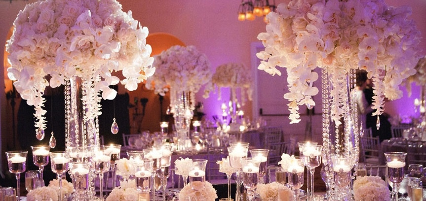
Sometimes simplicity, fullness and color are the only things you need to make a real statement. 
When talking about her creations she says it’s “just the right touch of extravagant elegance, and dazzling opulence wherever there is a desire for the beauty of extraordinary flowers.” Sounds like just the kind of magical combination needed for that special day.
0 Comments
Hey there flower lovers! This is Nicki Morris, incoming Social Media Assistant at Flour LA. Maybe it was something about visiting my grandfather's farm for the last time this Christmas, but there is always a special place in my heart for farm weddings. Verbena Floral Design's wedding inspired photo shoot, gives a full, romantic look to a country setting. 
These photos were taken on the Victoria Lavender Farm in Vancouver Island. The property has over 10,000 lavender plants. And purple has long been my favorite color, making it an amazing spot for any meaningful occasion. 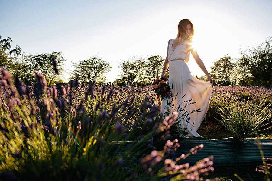
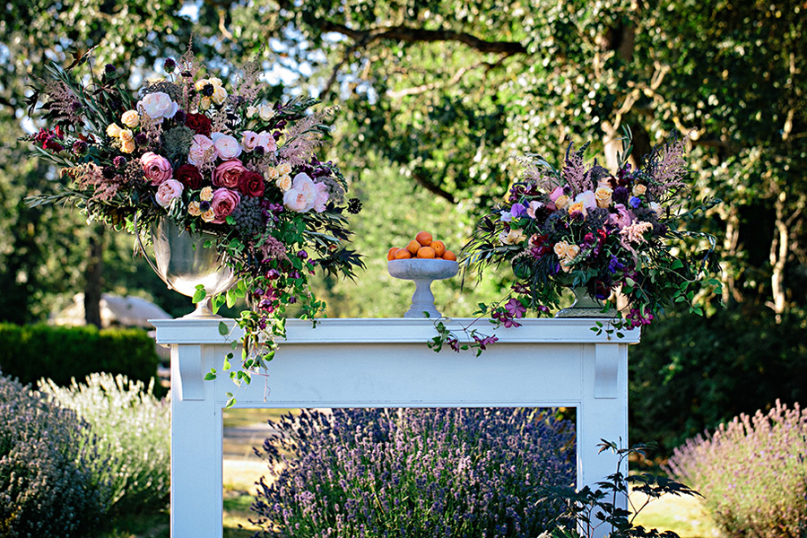
The colors are rich and romantic. Vanessa Watters of Verbena Floral Design explains her inspiration for the shoot: For our fall lavender shoot, we found inspiration from the rich colors, evening light, and coziness that comes with the change of seasons. Our color palette included the warm and burnt tones of autumn, and had a wide range for us to draw from. 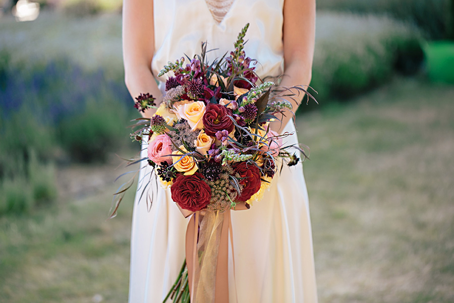
She continues: Effortless romance was brought to life through the bohemian gown and the long stemmed bouquet (the ultimate bouquet in romance department). All these elements just ooze romance and allow you to focus on the true theme of all weddings: love. 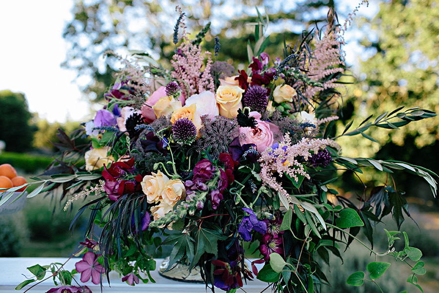
These designs take a blending approach to color palette. With different shades two or three shades darker and lighter, this arrangement blends together into a cohesive and romantic look. Captured beautifully by Jennifer Ballard Photography.
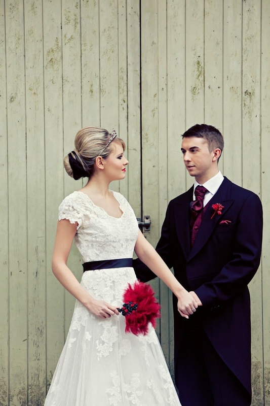
Filed Under: Editorial While researching some ideas for our Goth Beach Chic Photoshoot next month (what a mouthful, right), I stumbled across what is now hands down my favorite shoot that I've seen. This is why: It is done with emotion, elegance, and veers away from the cliche. I was gaga for the florals done by Red Floral Architecture (badass name too) based in the UK, and the concept was brilliantly executed by Perfect Choice. Lets find out the inspiration and back story to this artistic shoot! 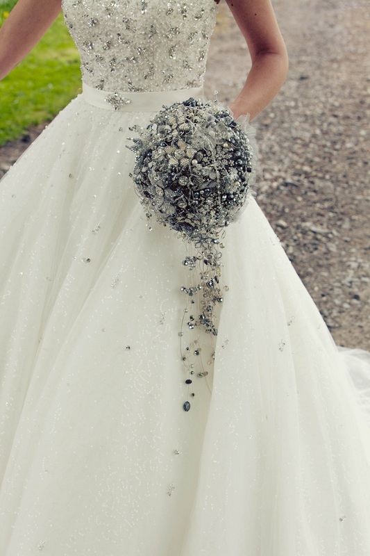
The bouquet above is made with crystals and buttons, in a round, topiary style, cascading style. I've never seen anything like this, and reminds me of a disco ball! In a good way. The designer Laura states, "We didn’t want to go overboard with the theme, so we decided to incorporate a classic yet mysterious feel, hopefully adding a timeless essence." The first picture that caught my eye was of the model with the mask. It is so delicate, yet gives big impact. These lucky vendors got to shoot at the magical Browsholme Hall and Tithe Barn. 
Look at the detail on the boutonniere! My goodness you need for patient hands to create that! They featured FIVE dresses with custom headpieces, and THREE different suits! They went all out! 
The photography is equally as splendid. Sharp, to the point, and stark. Just the way I like it. Photography by Alex Davies. 
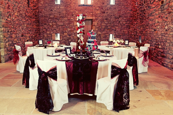
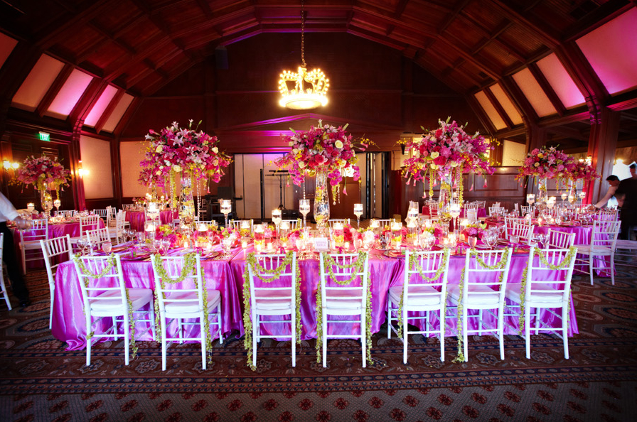
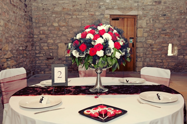
I like the below. While it may be debate for some affairs, the height and structure fits the room perfectly. It has the Tim Burton feel and even the gerbers, which are normally a childish flower, fit so well. The orchids provide elegance and tie the linens in quite well. 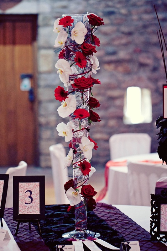
Simply stunning. I have no words.I like everything about this, and wish I made it! I like the netting tucked in, and the greenery on the bottom. I like the shape, the runner, I like it all! The colors are balanced and it feels regal. 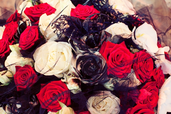
Filed Under: Weddings I found out about Alicia of Bella Fiori through her very useful and practical blog Flirty Fleurs, which she cowrites with Chuck of BLOOM, whom I wrote about in this over-the-top wedding post. 
At first when I looked at this ranch wedding, I thought that those were chair flowers!!! I had never seen such large chair posies before, but after a quick, closer look I realized they were in vases. I like how dramatic it is, and a good alternative to having a chuppuh or arch. Per Alicia, "When the bride first told us her vision for her wedding day décor she mentioned the movie What Dreams May Come. We took that vision and created her aisle full of color, bright pinks, purples, blues and lime green." It does in fact look like a painting, and very vibrant. Normally these colors together can get dull, but the wild yet modern structure provides a beautiful vibrancy sprucing up the otherwise neutral venue. 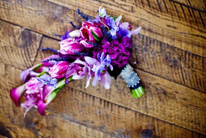
I'm not a huge fan of cascading bouquets, but the small, proportionate size of this really shines. I like everything about this, the use of texture, the color, and those fringe parrot tulips. I don't know about other florists, but for me, these types of bouquets are more challenging to construct, so I appreciate the mechanics of this piece! It has a nice variety of soft, exotic, and tropical, and is very well-balanced. Great job Alicia! The parasol below is made of blush pink dendrobrium and cymbidium orchids. I like how delicate it is, and I'm sure the bride had a lot of fun posing with it for photos. 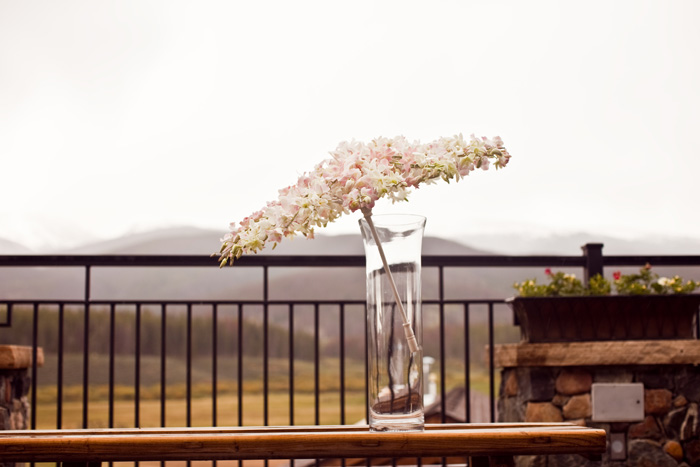
Filed Under: Editorial I was swooning over this editorial shoot inspired by the Edwardian Era (early Twentieth Century) that features such a subtle nod to the elegance and details that decorate that time. The colors of the purples and deep reds creates this very romantic, lush, magical feeling, as if the maid or florist of the house went to the rose bushes and cut them all, perfectly arranging them in ornate vases. Even the small cake, so quaint and understated is a reflection of the amount of thought that went into this.   The trailing greenery breaks up the colors and creates a romance. I love the asymmetrical design of the centerpiece, flowing in one direction off the dessert stand. 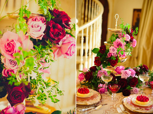 Per Shelley of Orchid Dynasty, "The opulence of this era was achieved through a simple floral palette of multicolored garden roses, Sweet Peas, Narcissus, Jasmine Vine, and Cattleya Labiata orchid blooms grown from our personal collection." Sweet Peas, Narcissus and Jasmine are my favorite scents in flowers, so I could only image the overwhelming fragrance gathering in the room. So gorgeous! Lauren from Saucy and Kistch adds, "We wanted the table to be full of rich feminine details. Beautiful mixed china piled on top of each other accented with a touch of lace and flowers that dripped off the table. The romantic paper goods feature a hand painted watercolor motif inspired by hand painted china."  Filed Under: Events You may recognize the name Ethnic Essence from my show sizzle for Dug Up with Carly Cylinder. I met Smitha originally at a networking event in Orange County some years ago, and then met her daughter coincidentally who works for an event marketing company I was doing business with. I've also rented vases from her for weddings, so Smitha has definitely come into my life for a reason. You will be blown away by their work if you ever get to go to her studio in Orange County. They house thousands of linens, vases, and pretty much anything else you'd need for a wedding of event. Her specialty are over the top Indian weddings. I love that her blog is organized by color-- so fun to peruse! 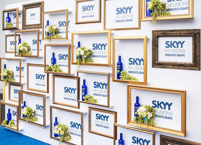
I love the frames for the Skyy event. It adds elegance and class. I've never seen frames like this on a step and repeat before. Very clever. And of course, everything they do is lush and over the top. I'm not normally a fan of standard topiaries, but the mercury glass candelabra below matches the ceiling so well. I love the grapes and hanging amaranthus. The antique palette can be hard to work with at times because it can get lost, but the metallics of everything below work so well together. 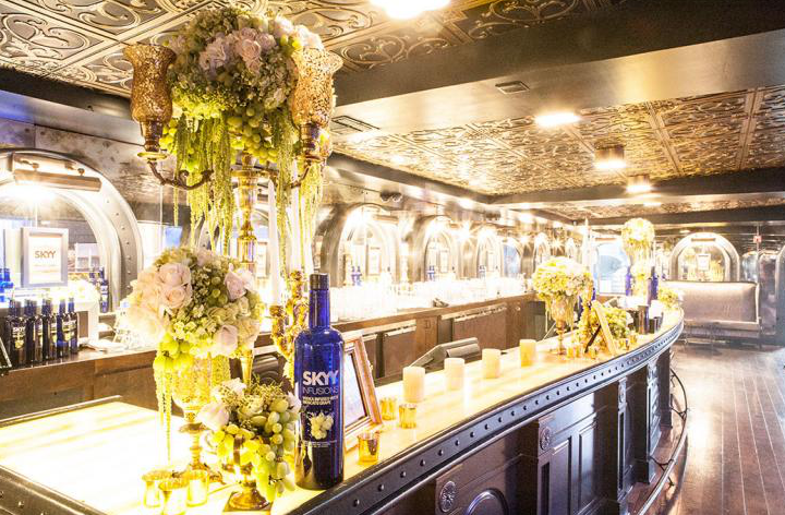
Thank you Smitha for everything. You're an inspiration as a truly wonderful person, and as a woman who built her business from the ground up. Much accolades and admiration to you!
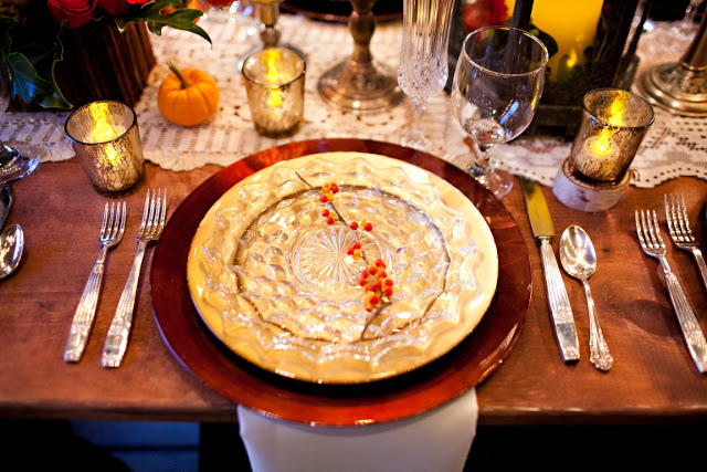
Filed Under: Editorial Emily, head of my Social Media, discovered this lovely shoot that we both found a lot of inspiration from. The attention to details is spot on, and Red Heels Events really added such personal touches. Per Emily, "Fall is officially here, although you wouldn’t know it in LA! Autumn is the best time of year, welcoming changing leaves, crisp weather, pumpkins, and all things apple." 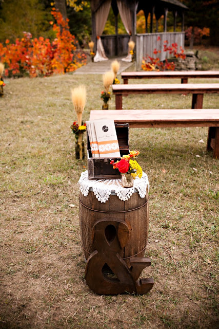
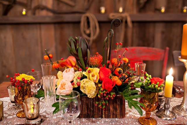
All the small details of this wedding really showcase the beauty of Fall. The ceremony and reception had traditional fall colors like deep oranges, rustic yellows, every shade of brown and small hints of blue throughout. Accompanying the fall color palette were beautiful rustic elements like whisky barrels, birch trees, and the natural splendor of the barn itself. 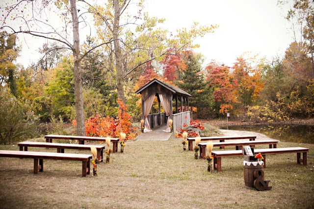
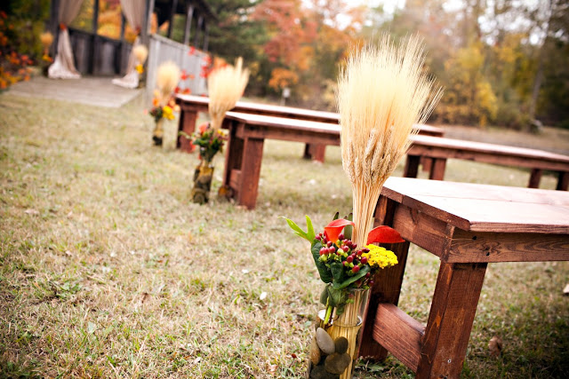
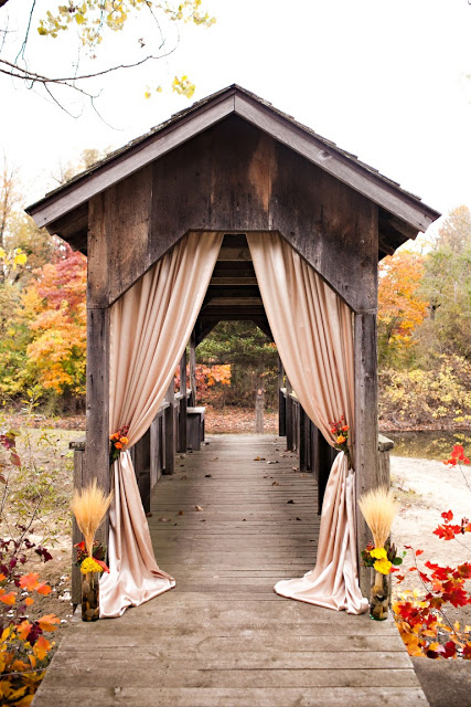
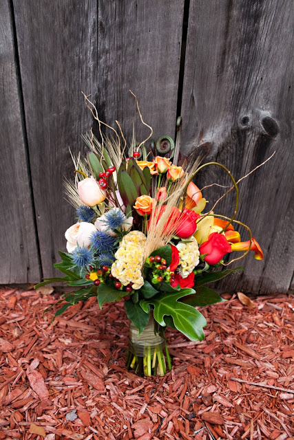
The bride’s bouquet was a stunning arrangement made by Skeeter Parkhouse in Grand Haven, Michigan. Michelle from Red Heels Events said “I was BLOWN AWAY by this bouquet that Skeeter from Eastern Floral did for us. The amount of depth, color and texture incorporated in it was breathtaking.” The flowers are common, yet exotic. They used thistle, coxcomb, roses, mini calla lilies, and hypericum (coffee bean), with touches of wheat. 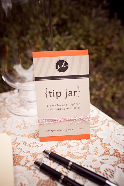
All pictures courtesy of Helter Photography! I love the details like this tip jar, cider stand, and birch ladder. Very cool! 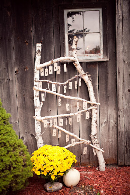
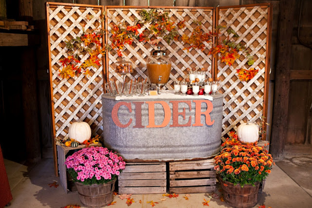
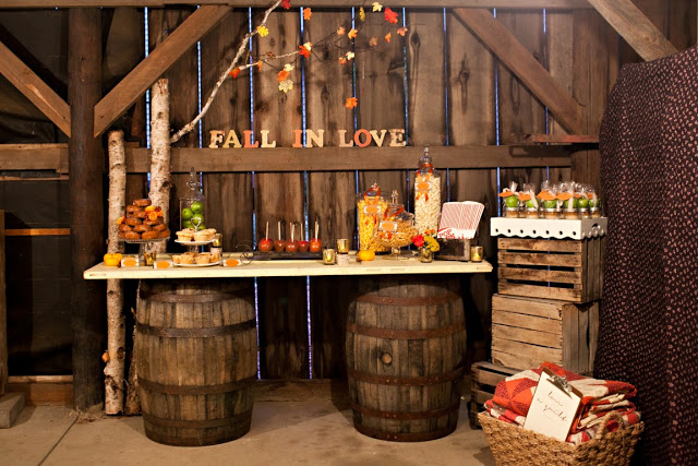
Thank you Emily for finding this gem, and to Michelle for sharing!
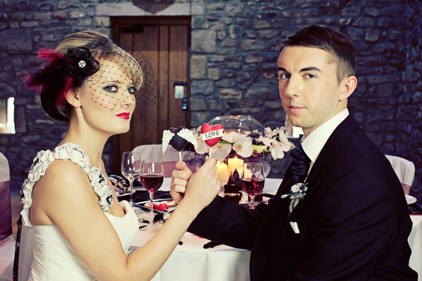
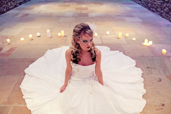
Filed Under: Weddings This out-of-the-box wedding took place at the Ritz Carlton in Atlanta, GA. I loved looking through the little details. The use of pink and black, traditionally feminine, was pumped up by their punk details, making this more funky than I'd expect. I asked their photographer Nadia D, based now in New York, for a bit of background on this wedding. Lets find out what she had to say! 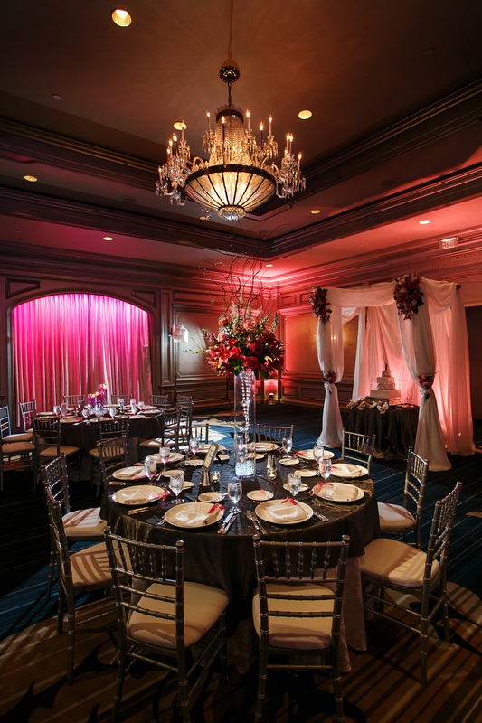 Per Nadia, "Both passionate motorsports enthusiasts from New York, the couple met through racing. They liked the idea of having a traditional, elegant wedding but wanted to incorporate an edgy twist to make it their own and show off their outgoing personalities. After a beautiful Jewish ceremony, the reception that followed included a lot of details that highlighted their love for racing including custom art on their printed materials, naming the reception tables after famous racetracks and a huge 2,800 horsepower racing turbocharger as the centerpiece for the escort card table." 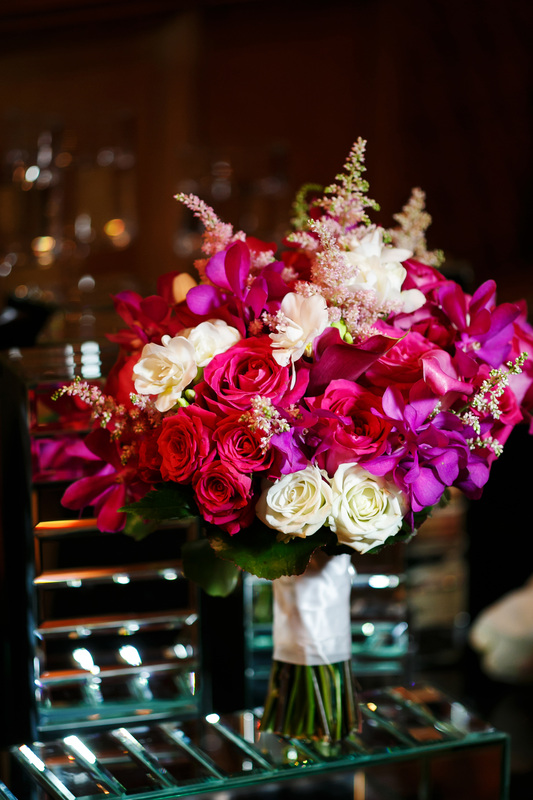 I love the structure of this bouquet-- textured, modern, and with a shape. Usually we see these type of flowers (roses, orchids, astilbe) used in a traditional round shape. I love the color combo of the magenta, pink, purple and white. It's constructed really well! Flowers by Tulip in Atlanta.  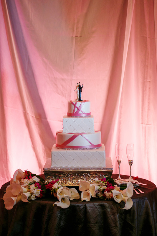 How cool is this cake topper?! So badass! Above, the bouquets are used to dress the cake table, which is a common thing to do. The linen really makes the cake pop and brings masculinity to the pink and white cake. 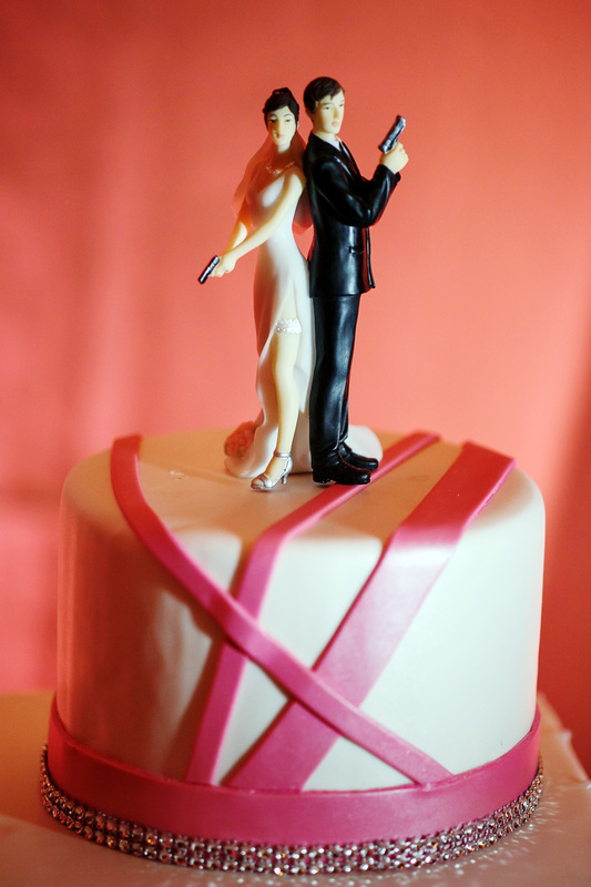 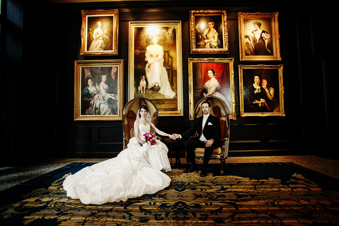 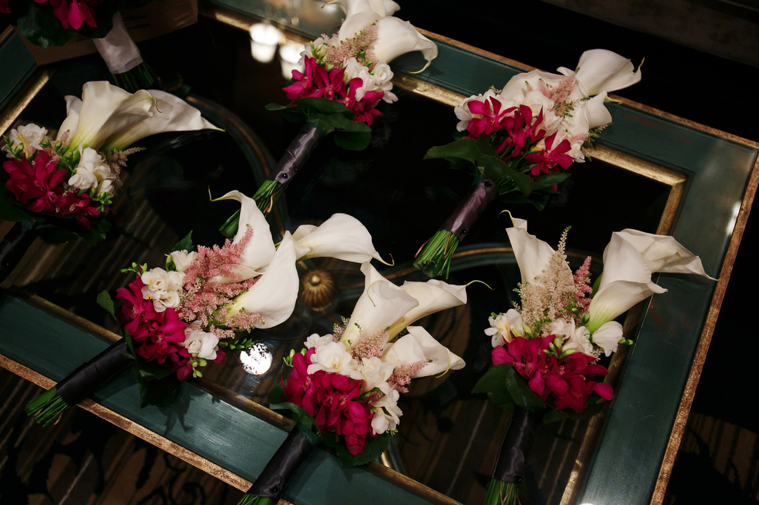 These boutonnieres are super fun. The accents really spice up normally bland callas. And how about those ring holder below! So cool! 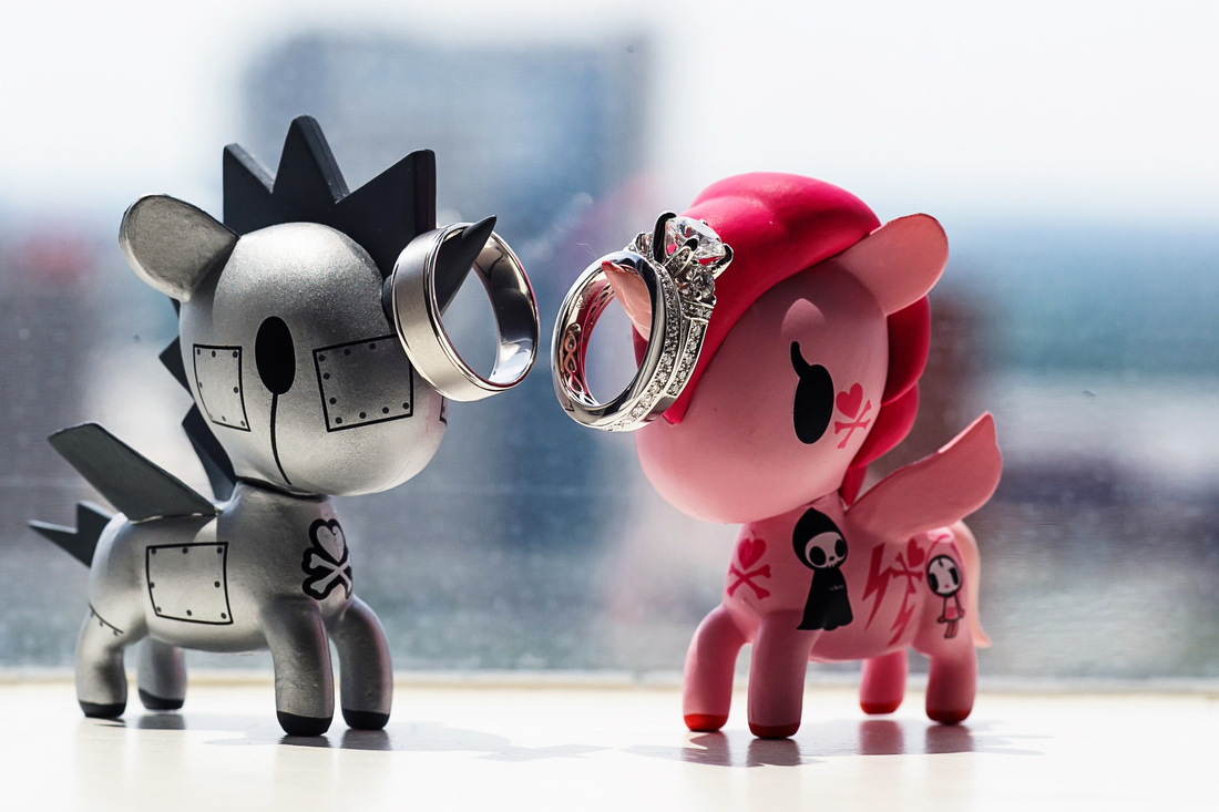 Thank you so much Nadia for sharing. I love how crisp your photos are! Cheers to beautiful photographs and a prosperous rest of the year!
Filed under: Editorial When I set my eyes on this shoot by A and B Style, I swooned. Mainly because I love when I see common elements, such as succulents and lanterns, used in a different way. Plus the florals used were locally grown. Boy, am I envious of this shoot! You can tell the love and passion that went into it. 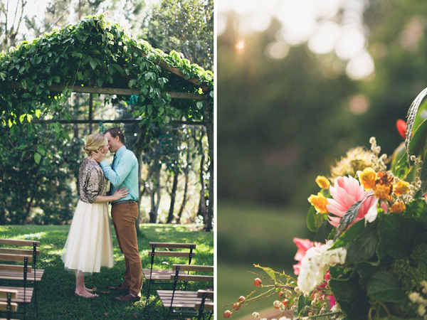
From Rebekah, "When I was designing this shoot I wanted to create something that was a spin on tropical destination weddings by it being inspired by the surroundings but not having to fit a particular palette you wouldn’t use outside of the locale (read: typical bird of paradise in/on everything and orange and brown being your most dominant colors)." 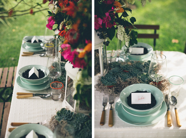
She continues, "The venue where the shoot took place was like Eden, all of the flowers from the shoot (except the protea) were all grown on-site. There were plants growing there that I’ve never seen in my life! Long blue hanging flowers that looked like orchids with big pods suspended from vines…it was like being in a Jules Verne novel. I used natural elements from the property, as well as coffee beans as a nod to the other part of the property that is a functioning coffee plantation." Photos courtesy of Twenty Twenty Studios. 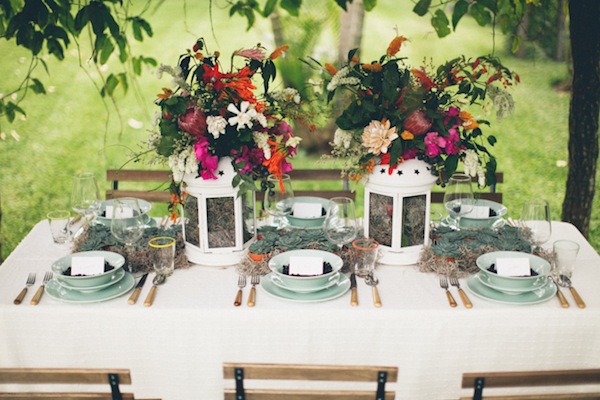
Thanks for sharing! I really enjoyed looking at these photos. Quite a talent!
Raven of Brooklyn, NY submitted an idea using the political elephant and donkey. The sketch is in the works, but I loved the idea of a fighting ring with the animals! We may through in a flag too;) 
|