|
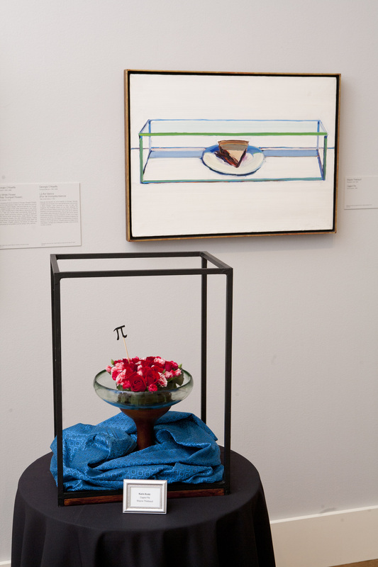
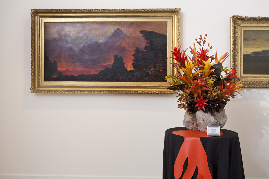
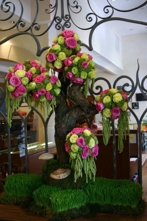
Filed under: Editorial, Holidays You know how much I love flowers imitating art-- really, everything is a version of something else, and we're all inspired by other works. I know they do this same thing in San Francisco, and have wanted to participate in a group show like this for some time. Perhaps next year! I'm gearing up to replicate some Warhols next week for an editorial shoot we're doing with a slew of top-notch vendors in LA. I digress... These images were provides courtesy of the San Diego Museum of Art (they even hold yoga classes in the museum!), and after finally going through them, am once again blown away. This one below is probably my favorite- the lines, the color, the texture, and those twisted leaves are pure perfection. 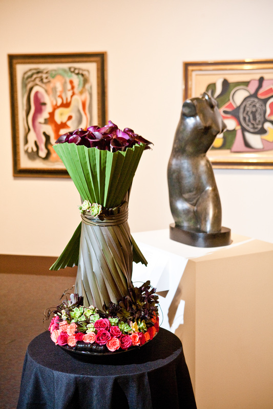
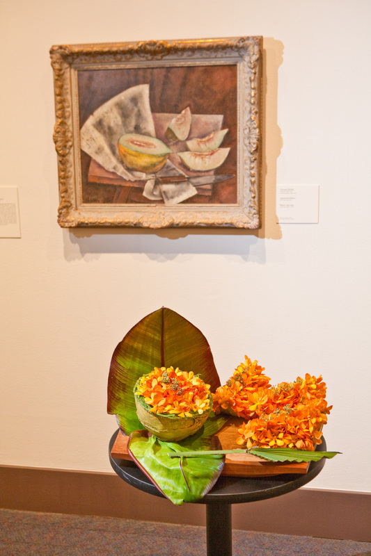
I also really, really like the above and below. It just looks so similar! You instantly get it. You get the emotion evoked, and the essence of the art. 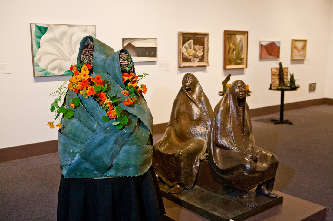
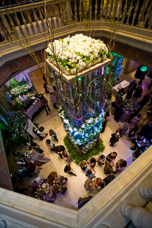
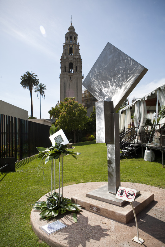
How cool is this insanely huge centerpiece?!?! 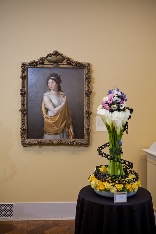
3 Comments
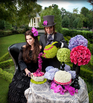
Filed under: Editorial, Events, Holidays You know I love a good theme, and Shane Walker's fine line between madness and genius can be seen in the shear fun and love expressed in his floral design below. It's so evident, right? How great is that Mad Hatter? I LOVE the teapot. So good. The Mad Hatter theme is one that's done again... and again... and again. Every freakin florist loves the Mad Hatter (I do too), but with this design, Shane nails it. This is the best one I've seen. And of course, the Native American to the right is equally creative too.
  There's something so crisp and clean about the designs we see here. I love love love anything clear and acrylic. It just is so timeless. And the apples below make for a refreshing splash of lime green against the white. I normally don't like these sorts of things, with just a fruit bowl, but the silver cups filled with what looks like china berries or green hypericum (coffee beans) really makes it pop into something more elegant. 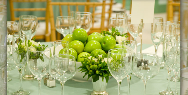  Shawn Walker Design Facebook
Filed under: Holidays, Events Mimi submitted this a while back, and as I was reviewing emails I took a closer look. Her company The Party Queen, based in Marin County, has some really fun designs on both small and large scale. Um, how cool is this tablescape?! It reminds me of David LaChapelle's work. I love her carefree attitude, yet she clearly has a set vision for her work. Her rolodex of clients is pretty impressive as well! Let find out the inspiration for these arrangements!  Mimi describes the arrangement above. "This display was part of a Halloween party where the theme was Corpse Bride. The Party Queen used deep purple dyed magnolia leaves as the base and added the protea, peacock feathers and dried winter berries for some contrast. To add elegance, diamond garland was cut into 18" pieces so it was more branch-like, and then the final touch was a loose draping of pearls for an upscale creepy elegance. There were 2 displays in urns that were 48" high so they were freestanding and large in scale in a Victorian living room setting", per Mimi. 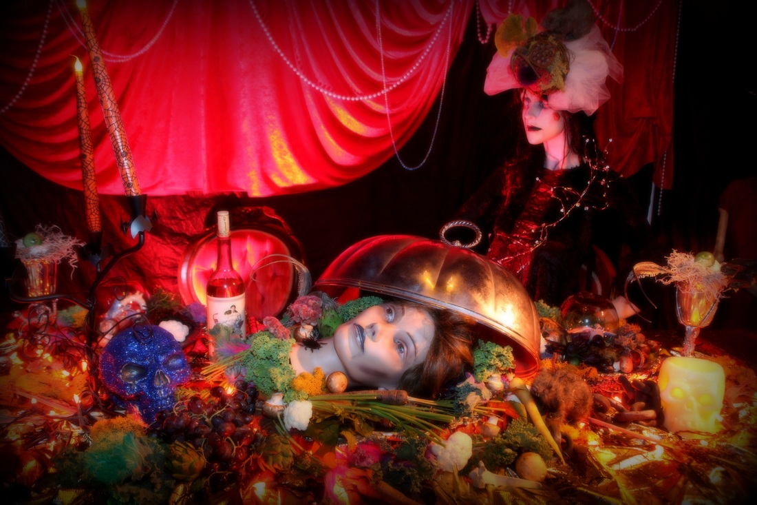 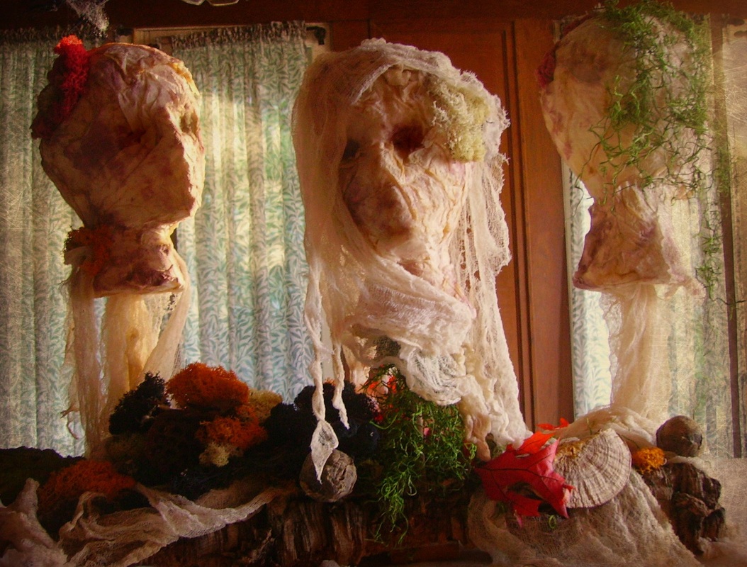 How cool are these?! Mimi said, "I was inspired by Martha Stewart for this project. The Party Queen took foam mannequin heads that we cut big gashes in the top of and covered them with torn paper towels that were dyed in strong tea. (we use a lot of strongly brewed tea around Halloween). To add highlights to the features, we painted fabric dye in the eye sockets and around the mouths. We also applied a more dye in a spray bottle to high light around the head. In the cut gashes, we stuffed various interesting died reindeer moss to mimic brains popping out. The heads were mounted on tiny dowels pushed through a piece of cork bark which gave it stability. We draped gauze to hide the sticks and around the heads to create shrouds. The bark was then propped in with various interesting dried things and more colorful moss. It was used as a centerpiece on the buffet."  The Party Queen Facebook
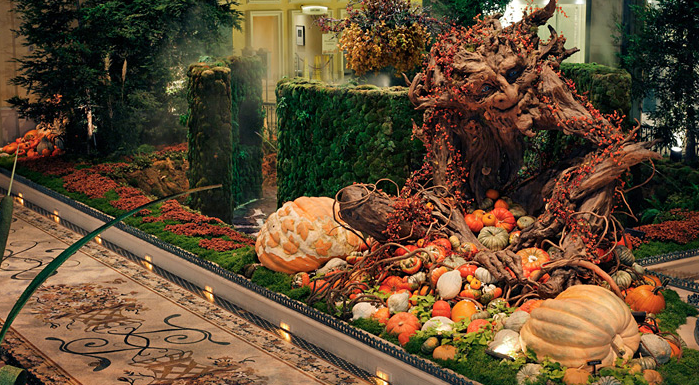
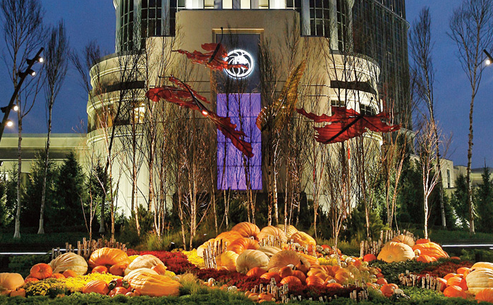
Filed under: Holidays Recently I landed in the Big Apple, home of some of the best floral design. You know I'm already a huge admirer of New Yorker's David Stark, Jes Gordan, and Emily Thomspon. There's so much talent here, as is to be expected. When I came across Ovando's super mod displays, my heart smiled in delight. I absolutely love the lines of the design, the way the curves lead down. So how do they do it?  Per Tran: "Our designers were able to create a design that really complimented with the clothing, not take away from it. They picked something neutral for a neutral setting, and they wanted to keep it interesting, textural, and architectural... ...One designer’s inspiration is to always try to do things that people don’t see on a daily basis. The key to good design is choosing very few, but strong impactful elements so you can take the time to appreciate it without it looking too busy. In this case, taking birch branches and positioning it in ways that will attract the attention of customers from the outside – it is simple, yet very different from the ordinary."  She continues, "Our motto is simple, not simplistic. We try to keep it at a minimum, but will still be able to create something very different, very impactful to the eye. Even if you have only one ingredient to work with, we are able to take that to the next level – making it lush and full to attract your attention and bring that focus to not only the arrangement itself, but the whole space as well - such as the picture of the lush orange leaves."    Filed under: Holidays, Events When I saw this from A Garden, Inc in Vegas my jaw dropped. I want to end 2012 in a BIG WAY. This is outrageously good. Like, Honey I Shrunk the Kids, good. Like Jurassic Park good. From Audra, "This autumn vine was one of my most challenging products mainly because of the rigging and the installation. The inspiration was a version of Jack and the Beanstalk with a vine emerging from the gardens and growing upward 110 ft in the air... 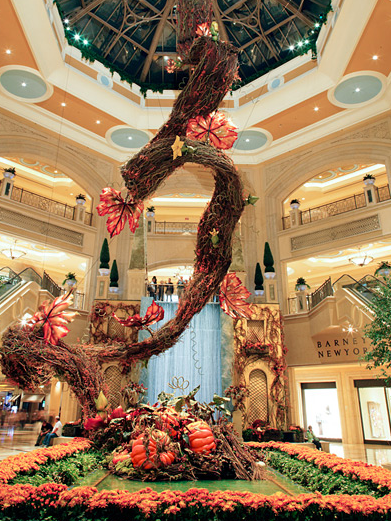
...We of course had a fall theme using a pumpkin patch as our source at the ground level gardens. This vine steel work was designed and built by a company who builds spiral staircases and was shipped in pieces for us to assemble in our Atrium at Palazzo Hotel Casino. Before it arrived in Las Vegas the steel spine was shipped to California to a willow grower to be covered in 3 different types of vines and stems. 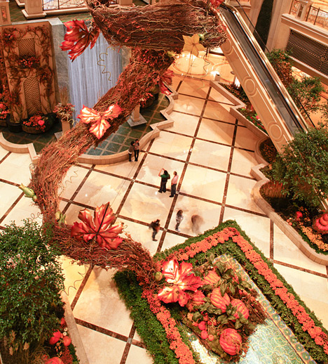
...After several days of weaving stems for coverage it then got shipped for us to assemble, rig, and hang in the atrium. This rigging and connecting the pieces in mid air took approximately 7 days for completion. After the vine was finally stable we were able to add the finishing touches with glass leaves, bittersweet and pumpkins. It was quite stunning and was complimented with real gourds, millet, mums, potato vines and various live plants in the gardens. Additionally we made a live pumpkin fountain and installed hundreds of cattails." 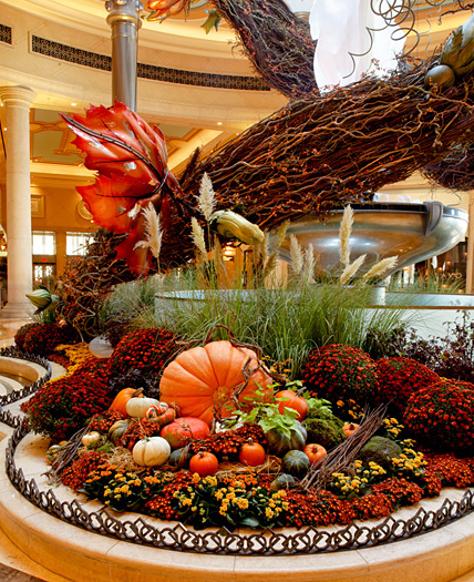
Filed under: Holidays I love this tabelscape from Rufus Felix (cool name, huh?) because it incorporates the very trendy wood risers in a very modern way. Per Traci, "The set up was for a party and I wanted to do something that was wintery but simple and sophisticated, something that worked well with the artwork and the colors of the home. I try to enhance the interior design and the space and this worked well." 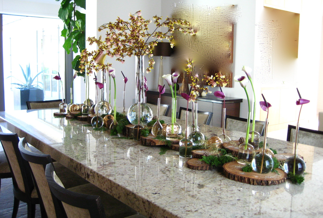 Traci notes, "The touches of evergreen and wood slices and glass ball ornaments added texture and a seasonal quality, while the vase choice and orchids and tulip anthuriums offer a more contemporary take on Holiday." I couldn't agree more. I love how simple this is, yet really brings a punch. You can use minimal flowers for a really big impact. I think this is a design lesson we can all be inspired from!  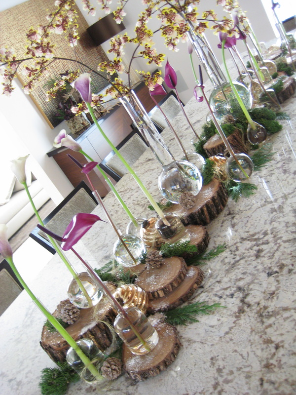 |