|
Filed Under: Editorial While researching some ideas for our Goth Beach Chic Photoshoot next month (what a mouthful, right), I stumbled across what is now hands down my favorite shoot that I've seen. This is why: It is done with emotion, elegance, and veers away from the cliche. I was gaga for the florals done by Red Floral Architecture (badass name too) based in the UK, and the concept was brilliantly executed by Perfect Choice. Lets find out the inspiration and back story to this artistic shoot! 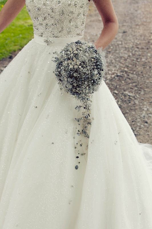
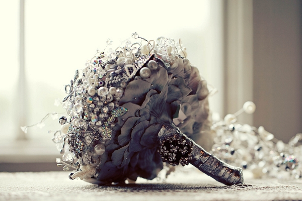
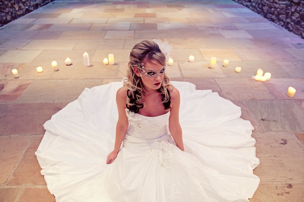
The bouquet above is made with crystals and buttons, in a round, topiary style, cascading style. I've never seen anything like this, and reminds me of a disco ball! In a good way. The designer Laura states, "We didn’t want to go overboard with the theme, so we decided to incorporate a classic yet mysterious feel, hopefully adding a timeless essence." The first picture that caught my eye was of the model with the mask. It is so delicate, yet gives big impact. These lucky vendors got to shoot at the magical Browsholme Hall and Tithe Barn. 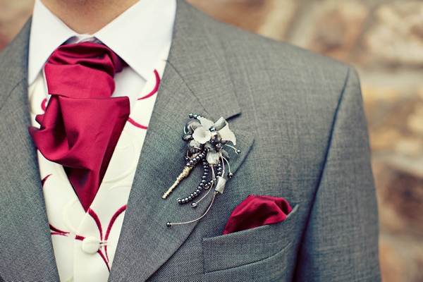
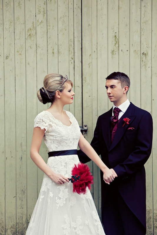
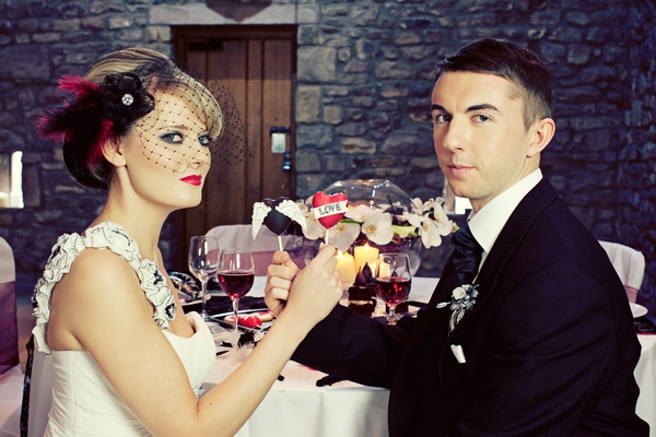
Look at the detail on the boutonniere! My goodness you need for patient hands to create that! They featured FIVE dresses with custom headpieces, and THREE different suits! They went all out! 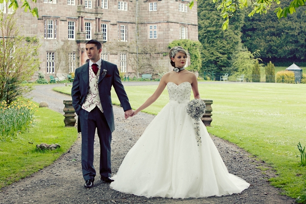
The photography is equally as splendid. Sharp, to the point, and stark. Just the way I like it. Photography by Alex Davies. 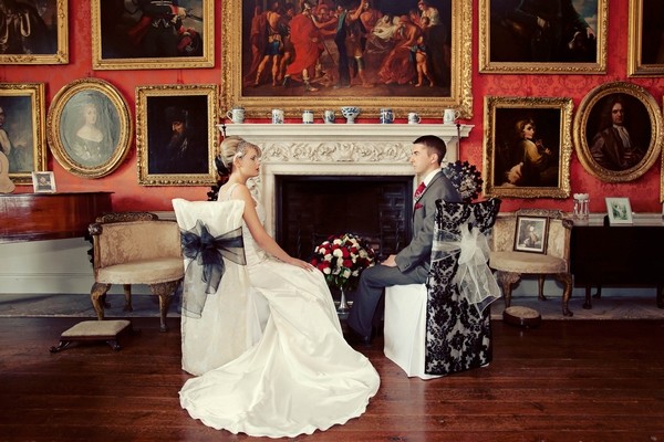
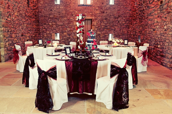
I like the below. While it may be debate for some affairs, the height and structure fits the room perfectly. It has the Tim Burton feel and even the gerbers, which are normally a childish flower, fit so well. The orchids provide elegance and tie the linens in quite well. 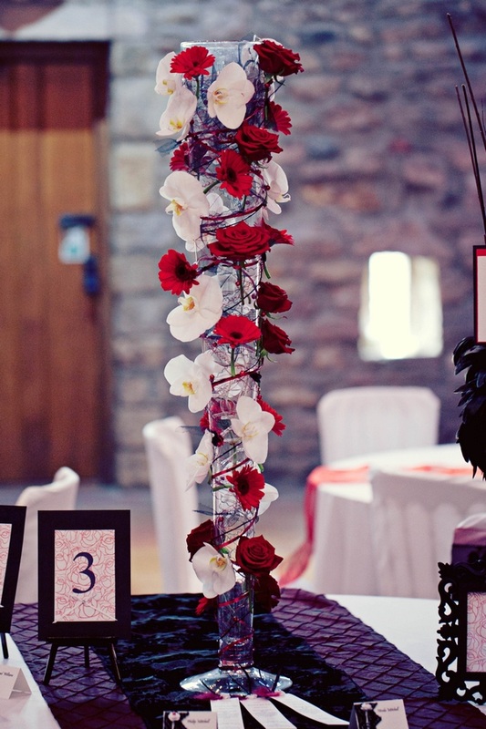
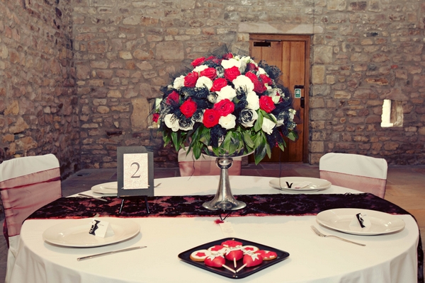
Simply stunning. I have no words.I like everything about this, and wish I made it! I like the netting tucked in, and the greenery on the bottom. I like the shape, the runner, I like it all! The colors are balanced and it feels regal. 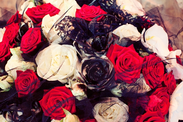
0 Comments
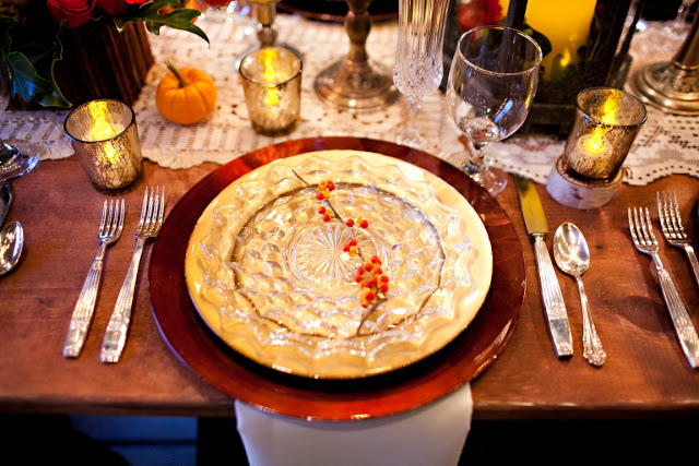
Filed Under: Editorial I was swooning over this editorial shoot inspired by the Edwardian Era (early Twentieth Century) that features such a subtle nod to the elegance and details that decorate that time. The colors of the purples and deep reds creates this very romantic, lush, magical feeling, as if the maid or florist of the house went to the rose bushes and cut them all, perfectly arranging them in ornate vases. Even the small cake, so quaint and understated is a reflection of the amount of thought that went into this. 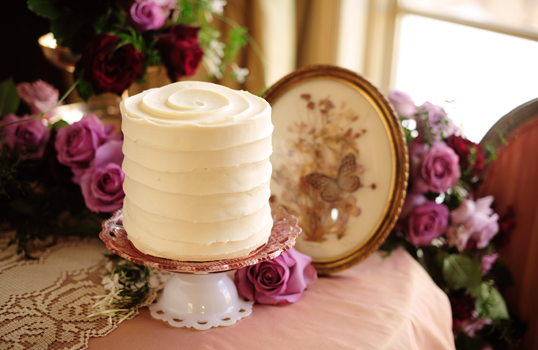 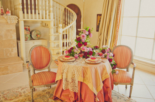 The trailing greenery breaks up the colors and creates a romance. I love the asymmetrical design of the centerpiece, flowing in one direction off the dessert stand. 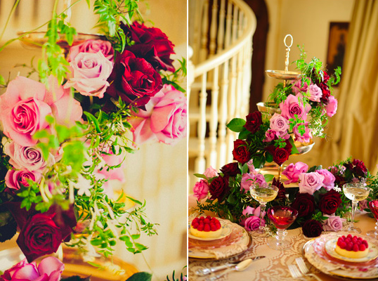 Per Shelley of Orchid Dynasty, "The opulence of this era was achieved through a simple floral palette of multicolored garden roses, Sweet Peas, Narcissus, Jasmine Vine, and Cattleya Labiata orchid blooms grown from our personal collection." Sweet Peas, Narcissus and Jasmine are my favorite scents in flowers, so I could only image the overwhelming fragrance gathering in the room. So gorgeous! Lauren from Saucy and Kistch adds, "We wanted the table to be full of rich feminine details. Beautiful mixed china piled on top of each other accented with a touch of lace and flowers that dripped off the table. The romantic paper goods feature a hand painted watercolor motif inspired by hand painted china."  Filed Under: Editorial Emily, head of my Social Media, discovered this lovely shoot that we both found a lot of inspiration from. The attention to details is spot on, and Red Heels Events really added such personal touches. Per Emily, "Fall is officially here, although you wouldn’t know it in LA! Autumn is the best time of year, welcoming changing leaves, crisp weather, pumpkins, and all things apple." 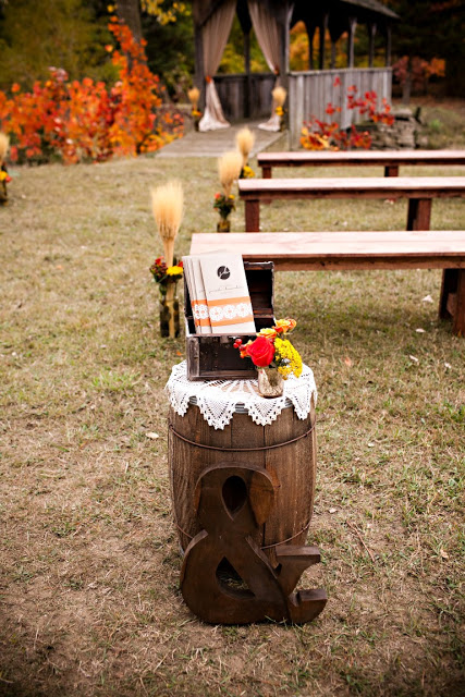
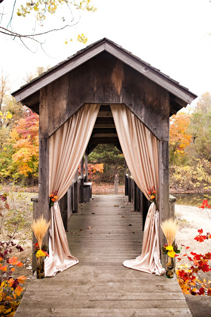
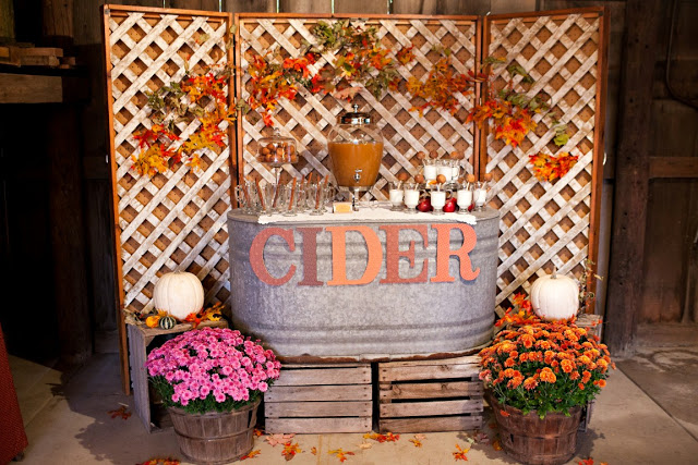
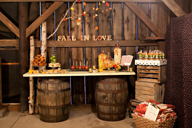
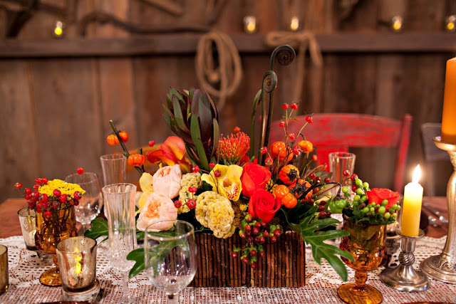
All the small details of this wedding really showcase the beauty of Fall. The ceremony and reception had traditional fall colors like deep oranges, rustic yellows, every shade of brown and small hints of blue throughout. Accompanying the fall color palette were beautiful rustic elements like whisky barrels, birch trees, and the natural splendor of the barn itself. 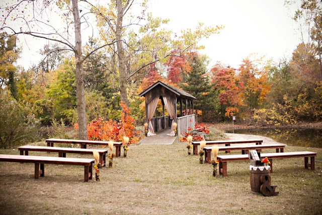
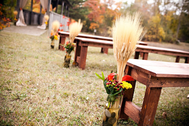
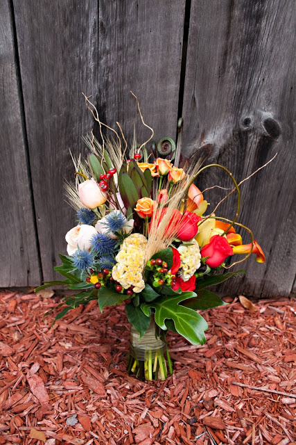
The bride’s bouquet was a stunning arrangement made by Skeeter Parkhouse in Grand Haven, Michigan. Michelle from Red Heels Events said “I was BLOWN AWAY by this bouquet that Skeeter from Eastern Floral did for us. The amount of depth, color and texture incorporated in it was breathtaking.” The flowers are common, yet exotic. They used thistle, coxcomb, roses, mini calla lilies, and hypericum (coffee bean), with touches of wheat. 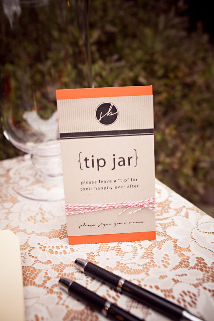
All pictures courtesy of Helter Photography! I love the details like this tip jar, cider stand, and birch ladder. Very cool! 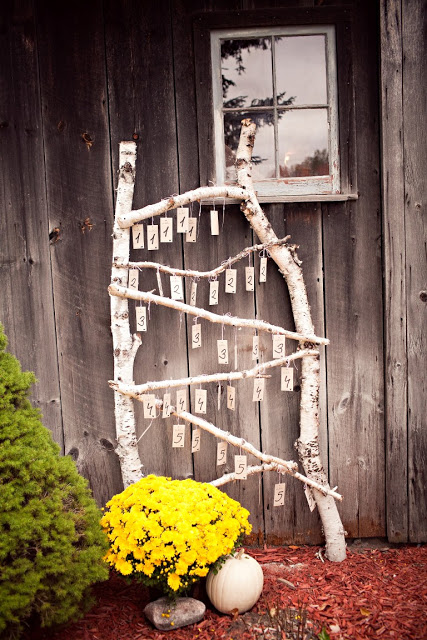
Thank you Emily for finding this gem, and to Michelle for sharing!
Filed under: Editorial When I set my eyes on this shoot by A and B Style, I swooned. Mainly because I love when I see common elements, such as succulents and lanterns, used in a different way. Plus the florals used were locally grown. Boy, am I envious of this shoot! You can tell the love and passion that went into it. 
From Rebekah, "When I was designing this shoot I wanted to create something that was a spin on tropical destination weddings by it being inspired by the surroundings but not having to fit a particular palette you wouldn’t use outside of the locale (read: typical bird of paradise in/on everything and orange and brown being your most dominant colors)." 
She continues, "The venue where the shoot took place was like Eden, all of the flowers from the shoot (except the protea) were all grown on-site. There were plants growing there that I’ve never seen in my life! Long blue hanging flowers that looked like orchids with big pods suspended from vines…it was like being in a Jules Verne novel. I used natural elements from the property, as well as coffee beans as a nod to the other part of the property that is a functioning coffee plantation." Photos courtesy of Twenty Twenty Studios. 
Thanks for sharing! I really enjoyed looking at these photos. Quite a talent!
Filed under: Editorial, Events I own all of his books, and have had the pleasure of touring his studio space in Carroll Gardens, Brooklyn. And this Fall I will be working with him! Really, to me, there is no one above David Stark and his team of creatives at David Stark Design. He started as a painter at my brother's alum RISD and then partnered with Avi where they opened a very modern, edgy and overall badass design studio. After their long career together, David broke off on his own.  I've been so lucky to get an insider's look into some of the most creative and smart people in the business. First I got to tour Martha's office this past summer, which deserves its' own post, and then got to see David's multi-level studio which expands into a huge workspace filled with every imaginable material that one could or would want to play with. They employ designers in all fields from graphic design to sculpture to carpenters. What I like most about the direction he's gone in is that they use materials in creative ways versus just having normal centerpieces for an event.  Recently they did a paper exhibit at The Whitney which looked like something out of Tron, and created a "bodega flower backdrop" for a Step and Repeat. Seriously, cool!   Filed under: Editorial, DIY You already know my love affair between fashion, art, music, and flowers. It just makes sense. I was so impressed by these really great flowers done by the eat/drink/garden goddess herself, Ms. Valerie Rice. Not to mention, I've never seen a sexier apron than the one she's created. I didn't even know that aprons could be sexy-- but turns out that they can be! Who knew?! 
When I first started Flour LA, I used to always give friends flowers for their birthday. But then pleasure became work, work became less than pleasurable, and I started to bring booze instead of blooms. But lucky for Val's friends, they still get these amazing arrangements! 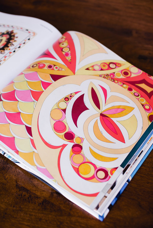
Valerie created this Pucci-inspired arrangement for her friend who loves Pucci. I love replicated patterns in florals, and Pucci definitely has a signature look that makes it easy to follow. 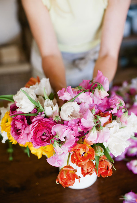
Above: Pucci inspired flowers, featuring ranunculus, sweet peas (my all-time fav flower), fringe parrot tulips, and crespedia (billy balls). The colors work well, and the white really creates such a fresh look. Orange, yellow, and pink always look good together too. 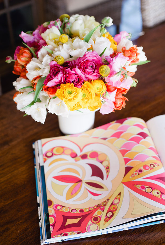
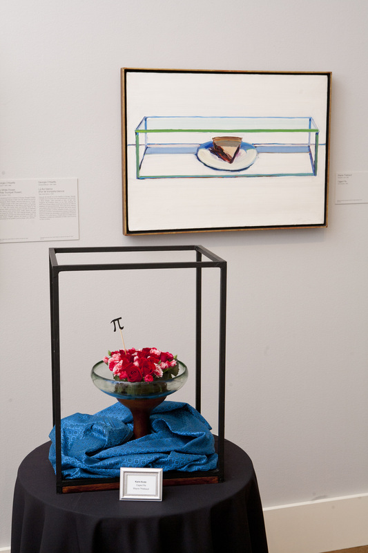
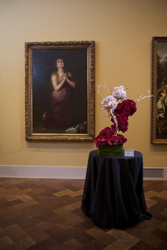
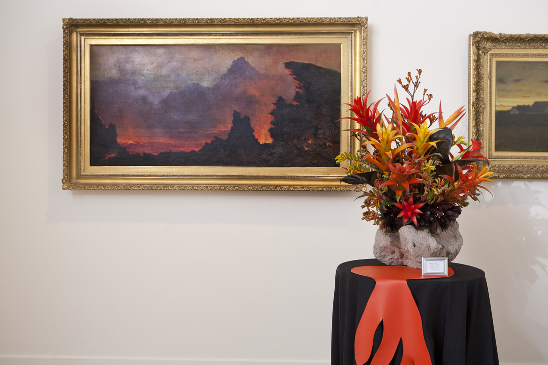
Filed under: Editorial, Holidays You know how much I love flowers imitating art-- really, everything is a version of something else, and we're all inspired by other works. I know they do this same thing in San Francisco, and have wanted to participate in a group show like this for some time. Perhaps next year! I'm gearing up to replicate some Warhols next week for an editorial shoot we're doing with a slew of top-notch vendors in LA. I digress... These images were provides courtesy of the San Diego Museum of Art (they even hold yoga classes in the museum!), and after finally going through them, am once again blown away. This one below is probably my favorite- the lines, the color, the texture, and those twisted leaves are pure perfection. 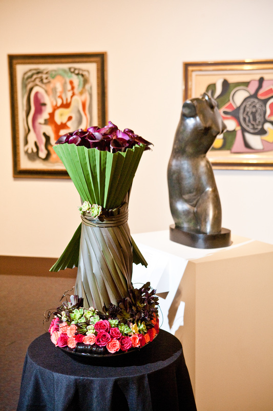
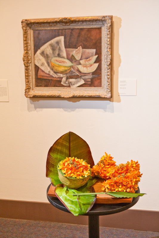
I also really, really like the above and below. It just looks so similar! You instantly get it. You get the emotion evoked, and the essence of the art. 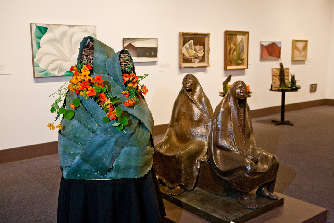
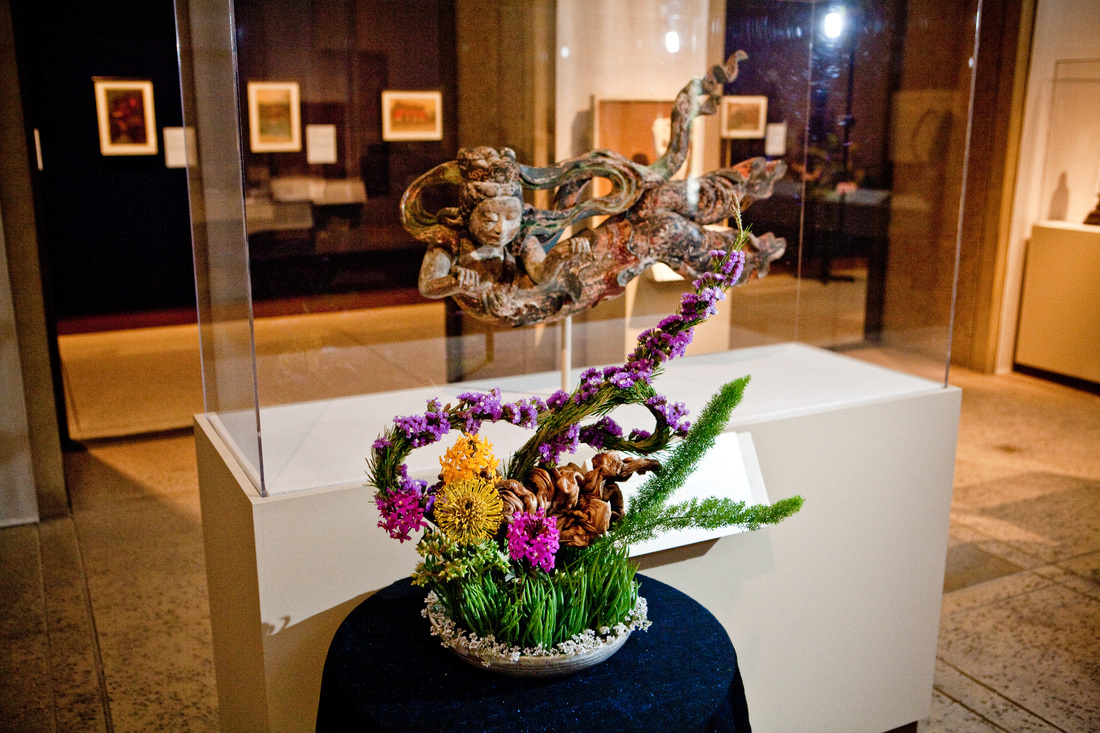
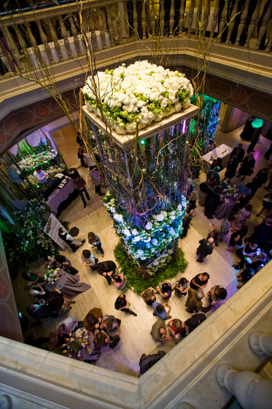
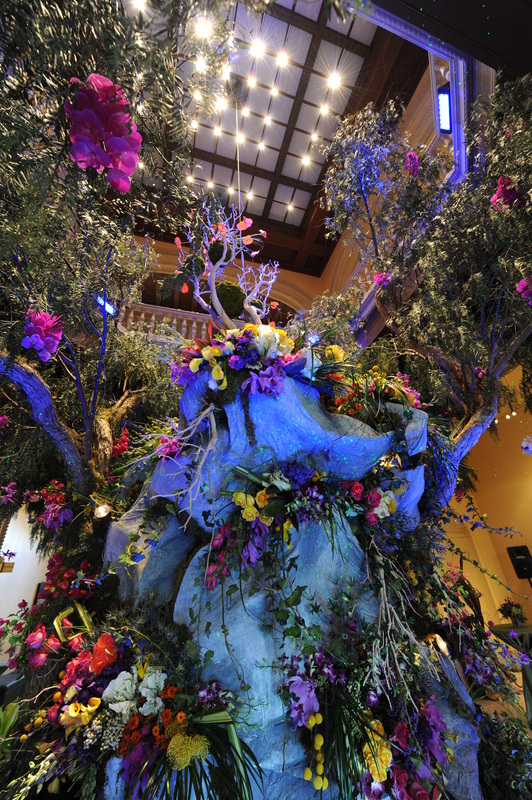
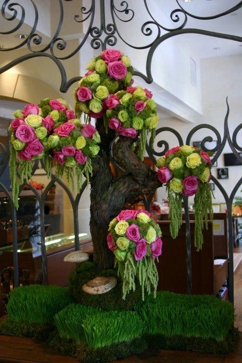
How cool is this insanely huge centerpiece?!?! 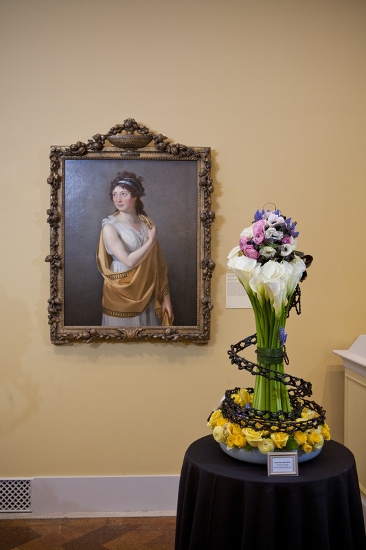
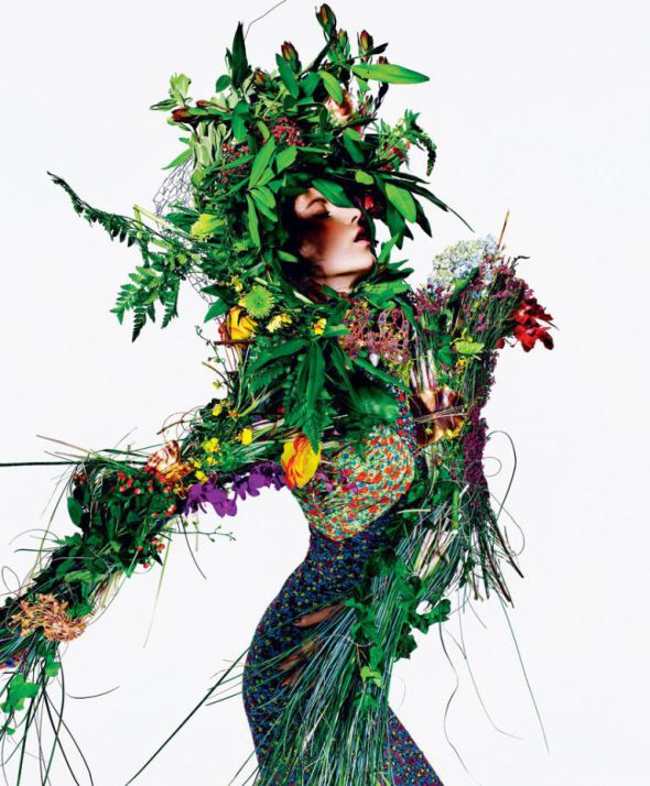
Filed under: Editorial I have no idea how I originally came across the images, but anything wild, fashion, editorial and bold, I freakin love. It's inspiring, vibrant, original, fun and playful, all at the same time. 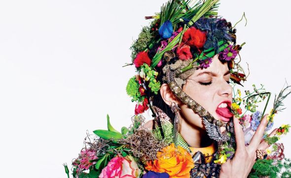
These images are by Richard Burbridge repped by Art + Commerce in NYC and was featured in New York Times Women’s Fashion Summer 2011. 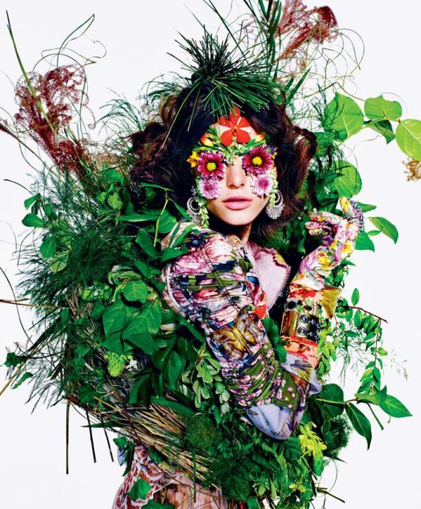
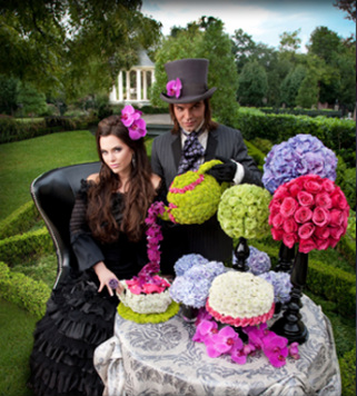
Filed Under: Editorial, Events, Weddings While researching design for an upcoming shoot, I came across Michael Speir's work, and just immediately said yes. To me, there's nothing better than seeing fine art come to life in floral design. It's the closest, best medium to work in, when being inspired by, mimicking or replicating a fine art piece. 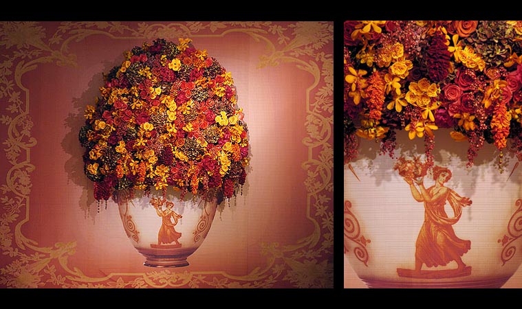 A tapestry coming to life. I love how Victorian this looks. Dried flowers would work well here and make for a lasting art piece. 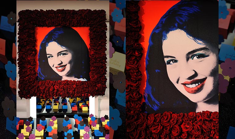 Above - a Warhol inspired portrait for a bat-mitzvah. A rose frame captures the essence of the pop art. Below- Orchid chandelier I love this because the orchids are horizontal versus the vertical we normally see. Per Michael, "I was inspired to create a pristine classical setting, richly appointed with lush floral furnishings and living trompe-l'oeil walls. My client really wanted something regal, opulent, and pure."  Filed under: Editorial, Events, Holidays You know I love a good theme, and Shane Walker's fine line between madness and genius can be seen in the shear fun and love expressed in his floral design below. It's so evident, right? How great is that Mad Hatter? I LOVE the teapot. So good. The Mad Hatter theme is one that's done again... and again... and again. Every freakin florist loves the Mad Hatter (I do too), but with this design, Shane nails it. This is the best one I've seen. And of course, the Native American to the right is equally creative too.
  There's something so crisp and clean about the designs we see here. I love love love anything clear and acrylic. It just is so timeless. And the apples below make for a refreshing splash of lime green against the white. I normally don't like these sorts of things, with just a fruit bowl, but the silver cups filled with what looks like china berries or green hypericum (coffee beans) really makes it pop into something more elegant. 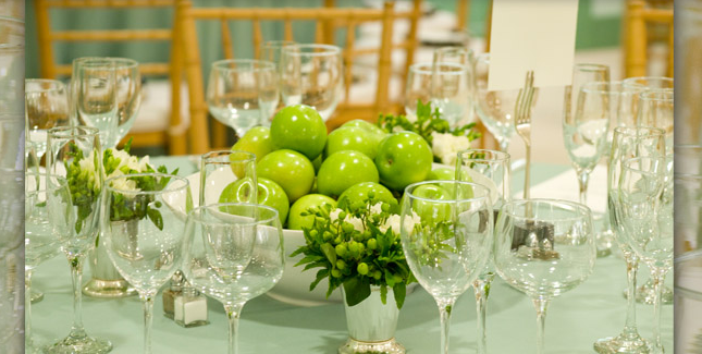  Shawn Walker Design Facebook
|