|
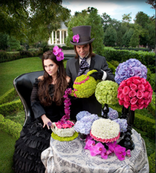
Filed under: Editorial, Events, Holidays You know I love a good theme, and Shane Walker's fine line between madness and genius can be seen in the shear fun and love expressed in his floral design below. It's so evident, right? How great is that Mad Hatter? I LOVE the teapot. So good. The Mad Hatter theme is one that's done again... and again... and again. Every freakin florist loves the Mad Hatter (I do too), but with this design, Shane nails it. This is the best one I've seen. And of course, the Native American to the right is equally creative too.
  There's something so crisp and clean about the designs we see here. I love love love anything clear and acrylic. It just is so timeless. And the apples below make for a refreshing splash of lime green against the white. I normally don't like these sorts of things, with just a fruit bowl, but the silver cups filled with what looks like china berries or green hypericum (coffee beans) really makes it pop into something more elegant. 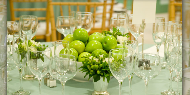  Shawn Walker Design Facebook
0 Comments
Filed under: Events It is clear when looking at Maggie Gillespie Designs she has a very lush, romantic feel. It's no surprise then, when I saw this modern designs below, I was immediately drawn to it. It's just my personal taste. But the rest of her designs are very dramatic, and how we often think of flowers, deservingly so. Lets find out her inspiration! 
Per Maggie, " Thiswas inspired by someone else's work that I had seen somewhere. This was years before Pinterest, (smiling)but not years before print! But I thought the scale of the other was off and elongated the cylinders, shot light up through them making a light table from a 60" round and adding floating candles with submerged orchid cylinders massed below for a little extra light. The inspiration was from the couple who loved orchids and a mix of ranch and contemporary, he who was from a south Texas ranch and she was from the big city, so the locale was at a rustic setting with modern tables. That table was the corner of an L shaped bar shortly after that photo was shot." 
Maggie Gillespie Designs Facebook
Filed under: Holidays, Events Mimi submitted this a while back, and as I was reviewing emails I took a closer look. Her company The Party Queen, based in Marin County, has some really fun designs on both small and large scale. Um, how cool is this tablescape?! It reminds me of David LaChapelle's work. I love her carefree attitude, yet she clearly has a set vision for her work. Her rolodex of clients is pretty impressive as well! Let find out the inspiration for these arrangements!  Mimi describes the arrangement above. "This display was part of a Halloween party where the theme was Corpse Bride. The Party Queen used deep purple dyed magnolia leaves as the base and added the protea, peacock feathers and dried winter berries for some contrast. To add elegance, diamond garland was cut into 18" pieces so it was more branch-like, and then the final touch was a loose draping of pearls for an upscale creepy elegance. There were 2 displays in urns that were 48" high so they were freestanding and large in scale in a Victorian living room setting", per Mimi. 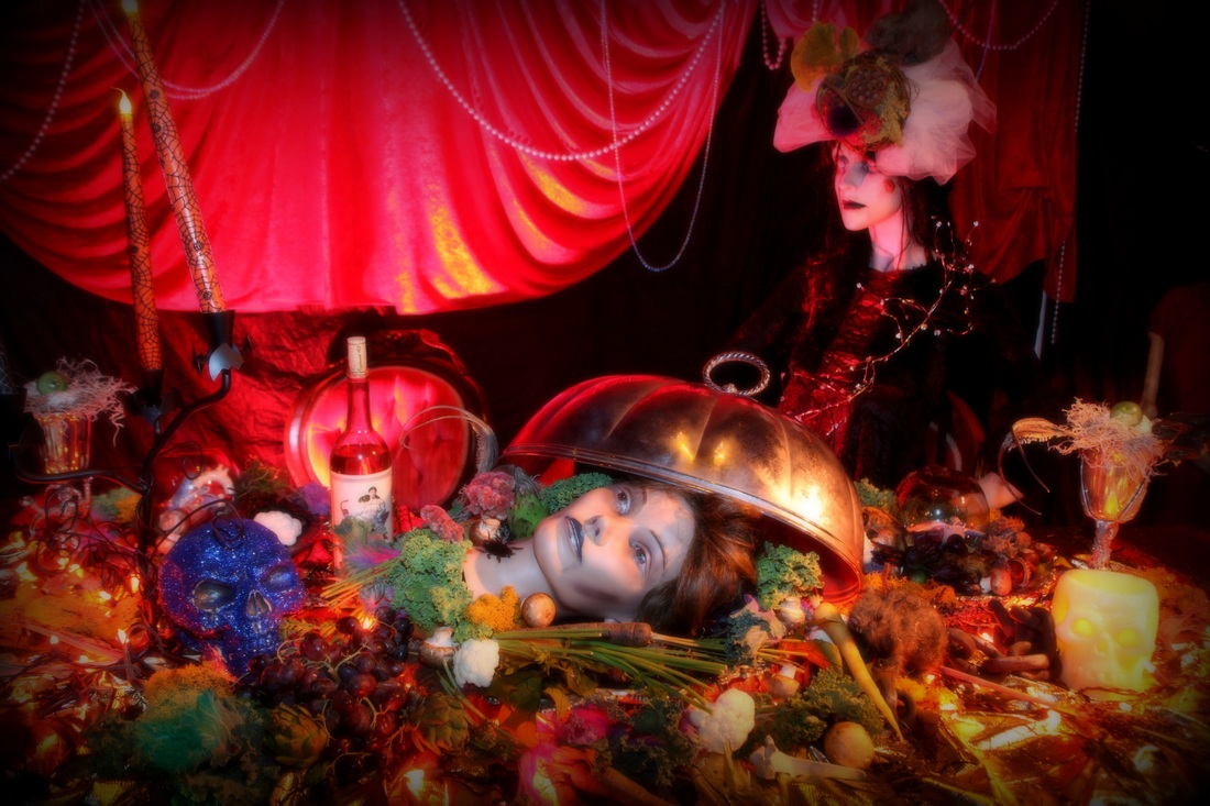 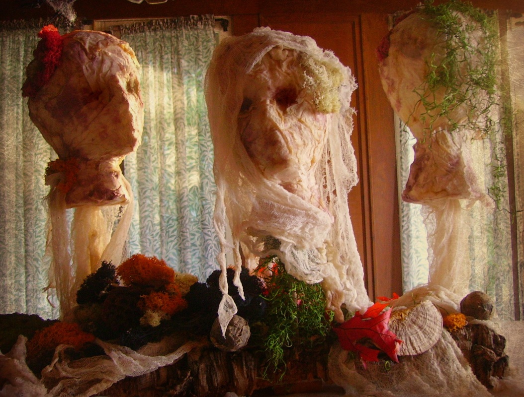 How cool are these?! Mimi said, "I was inspired by Martha Stewart for this project. The Party Queen took foam mannequin heads that we cut big gashes in the top of and covered them with torn paper towels that were dyed in strong tea. (we use a lot of strongly brewed tea around Halloween). To add highlights to the features, we painted fabric dye in the eye sockets and around the mouths. We also applied a more dye in a spray bottle to high light around the head. In the cut gashes, we stuffed various interesting died reindeer moss to mimic brains popping out. The heads were mounted on tiny dowels pushed through a piece of cork bark which gave it stability. We draped gauze to hide the sticks and around the heads to create shrouds. The bark was then propped in with various interesting dried things and more colorful moss. It was used as a centerpiece on the buffet."  The Party Queen Facebook
Filed under: Weddings, Events, Editorial I originally wrote about the designs of Parrish Designs for a 2012 Trends Huff Post article. They have a new website up, and when I saw this headpiece below, I thought of one thing- Carrie! Lets find out the inspiration of these designs. To me they scream Sex and the City- with the funk, modern edge, and color combos that give a real punch. 
From the owner Kathryn, "The style and look of the headpiece was driven by the clients’ personality. She was having an informal beach wedding and wanted to incorporate that feel and requested feathers and orchids. Beyond that, she gave us free reign to design the piece. This headpiece really gave me an opportunity to run with my creativity. I used blue vanda orchids, bridal netting, and two varieties of white goose feathers. The bride complimented it with her own veil." 
She continues, "We went into this décor arrangement with our new website in mind. This design was driven by the white acrylic columns, which we had recently acquired, and complimented by the other white furniture. To contrast the starkness and modern feel of the white furniture we used very soft romantic flowers and colors with hydrangea and garden roses. The drama of the white furniture was continued into the arrangements with the use of the black dahlias."
I love this so much, and those black dahlias are killer! Even I couldn't tell that those were dahlias. I thought there were black balsa wood! Love both of these. Thanks Kathryn! Parrish Designs Facebook Marley of The Party Goddess and I are in the same women's business group (SMARTY), and follow each other on the social media circuits. She's a powerhouse business woman, author, and many more dashes than that. I had so much fun watching a video about her on her accompanying business website. On a totally unrelated note, while perusing her blog, she mentions her love for apple cider vinegar. I've started using an Aztec Clay mask (you can buy it at Whole Foods for $7) that you mix equal parts with apple cider vinegar. I had no idea the health benefits of taking a shot of the vinegar until just now! Thanks Marley! And now back to the shower... 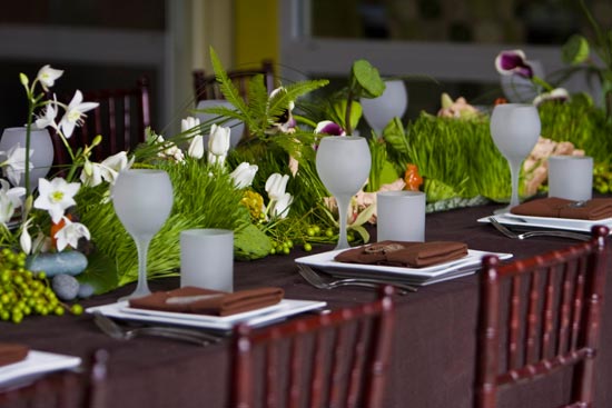
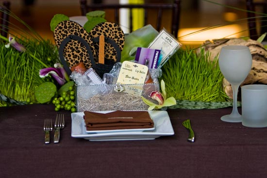
What drew me to this centerpiece was the lushness of the grass and how the flowers pushed it on different angles. I'm sure used to seeing wheat grass perfectly neat with flowers poking out from them. I love how natural, yet put together this looks and how tall the grass is-- so fresh and clean! She used a mix of exotic (lotus pods, coxcomb) and regular flowers (tulips, orchids) in a soothing palette of yellows and greens. 
From Marley, the Head Goddess of them all, "The bridal shower for a super hip, sassy chick who wanted something elegant and modern but with a cheerful pop of color. Attendees were treated to mani/pedis and mini massages so we were trying to incorporate some Zen like colors for relaxation without getting too literal." 
Originally spotted on my good friend's Vanessa De Vargas's Instagram of Turquoise, I love this arrangement by The English Garden in Las Vegas for the magneficient duo Woodson * Rummerfield's House of Design room for the Stanley Furniture showroom. 
I asked Jaime what their inspiration was for this room. It was by client request; a W&R signature style that featured SIX different collections of Stanley furniture.
I love the blue walls, the old world style, yet somehow updated with a modern twist. What drew me to this arrangement was the color (remember from school the color wheel; that orange/yellow works well with blues), the height, and the bear grass woven throughout. As florists the goal is to enhance a room instead of making it the focal point. Twitter: Woodson & Rummerfield, Facebook Filed under: Events When Anne submitted photos from G. Fiori, this one caught my eye for the main reason that the oranges were on the outside of the vase and the arrangement was very structural and each piece fit exactly where it should. She explains where the inspiration came from-- 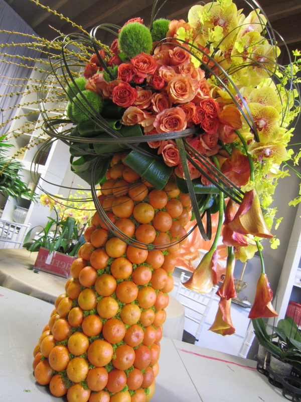
-- Per Anne, "The event was a celebrity charity event that featured an art auction with an emphasis on California artists. They asked us to come up with a 'California' theme for the floral decor. G Fiori Floral Designer extraordinaire, Guillermo Del Pero created this buffet piece for the event. All proceeds from the auction were for Aids Project Los Angeles."
Filed Under: Events, Weddings How cool is this floral frame by FlorUnique? Head florist Winnie let me in on how she created this and what her inspiration was - lets find out! 
Per Winnie, "The design was created for the Torrance Art Museum which is known for their emphasis on modern and contemporary art. My thinking was to create an modern artwork of flowers, framed in a box, but with some protruding elements so that the design would not be constricted. I therefor extended the Helikonia beyond the frame and swooped the ribbon woven bear grass down, outside the box, to connect with the two loose green Cymbidium orchids." 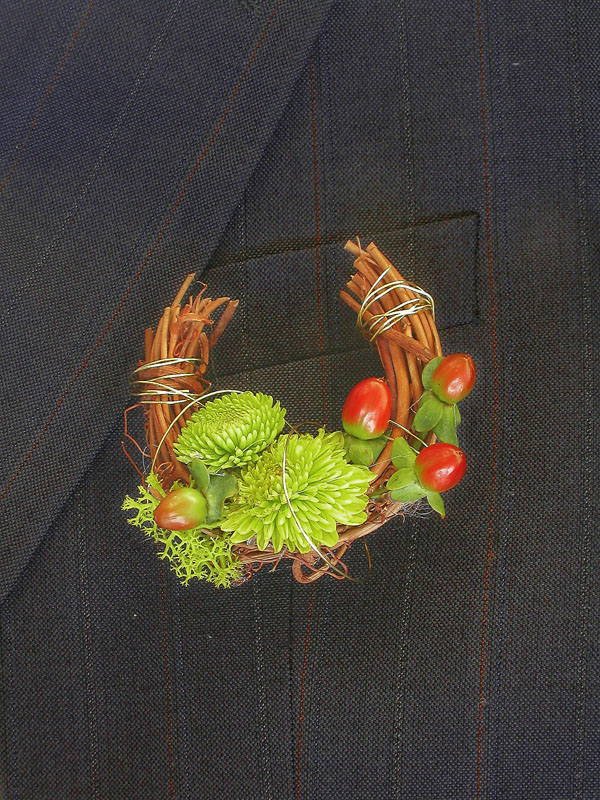
I also love the super cool boutonniere above. It's like a mini piece of wearable art.
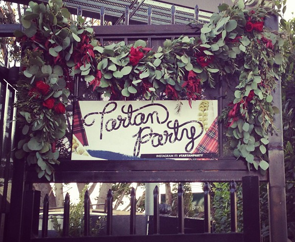
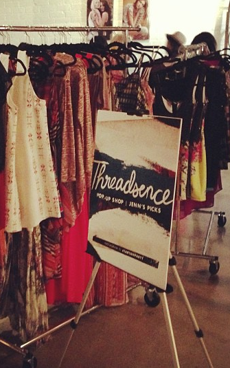
FlorUnique Facebook Filed Under: Events Flour LA had the privilege of working with event trio superstars Sugar and Fluff for their Tartan themed party Pop-Up Shop. They are big fans of organic and very dramatic looking flower arrangements. I think Sine Maria, lead designer and events manager, did a great job of creating their vision and bringing it to life. 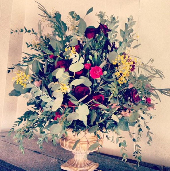
Filed Under: Events I know Sylvia through a woman's group Lipstick Sisters, and it's been fun getting to hear about her business Sylvia Jaimes Floral Design. Per Sylvia, "In my arrangemenst you will see I blend together the most delicate pieces with most roughest, sexy with conservative, feminine with masculine." 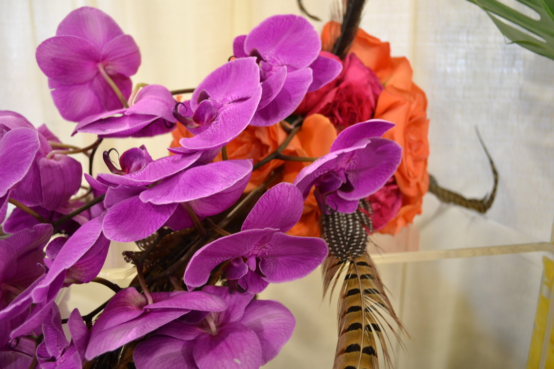 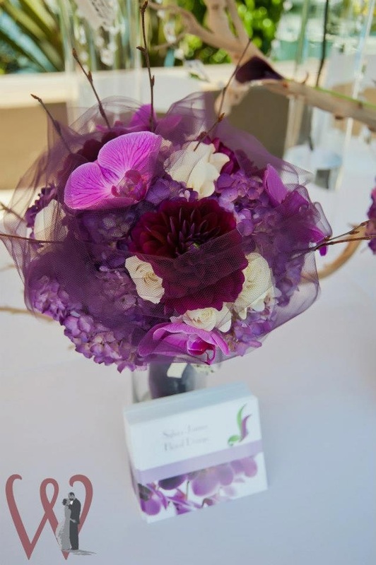 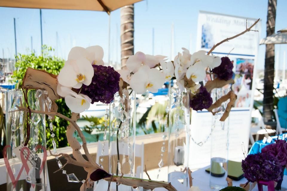 Sylvia Jaimes Facebook
|